Australia's cockroach problem
Domestic inflation never came close to target during the RBA's easing cycle, and just like cockroaches, it's back again.


I'm going to break my own rule today and post two charts, both of which are from Australia's just-released national accounts data for the December 2025 quarter. The first is the Gross National Expenditure (GNE) deflator, which is the best available measure of domestic demand-side (i.e., monetary policy-induced) inflation. For the uninitiated, Australia's headline GDP deflator is frequently distorted by volatile commodity export prices, something the GNE deflator strips to give a cleaner signal of what's happening to prices in the economy.
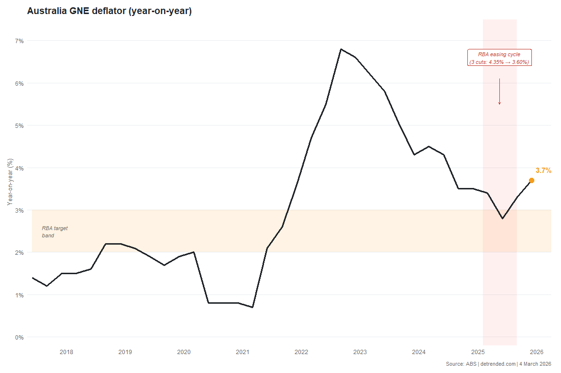
In the December quarter the GNE deflator rose 0.95%, taking the year-on-year rate to 3.7%, the highest since mid-2024 and firmly above the RBA's 2-3% target band. More importantly, the trajectory is unmistakable: after briefly dipping to 2.8% in June 2025 on the back of various government subsidies to things like energy prices, domestic price growth has re-accelerated for two consecutive quarters.
In essence, the RBA goofed. The first cut of what Bloomberg described as "one of the shortest and shallowest easing cycles in the developed world" happened in February 2025, the month prior to the May federal election. As Treasurer Chalmers said at the time:
"Under Labor, inflation is down, wages are up, unemployment is low and now interest rates have started to come down too. This is the soft landing we have been planning for and preparing for."
The fortuitous rate cut no doubt helped Labor, although a Liberal party implosion and Trump 2.0 in the US did most of the work. Was Michele Bullock, who Chalmers appointed RBA governor in late 2023, returning the favour? We'll never know, but the timing of the first cut was certainly convenient and, in hindsight, completely wrong. As economist John Cochrane has said, inflation is like cockroaches: "When there are only a few left and you're on a downward glide path is not the time to let up."
The other chart I want to show today is government consumption as a share of GDP. When the pandemic hit, all levels of government ramped up their spending to compensate for people being locked down. It briefly fell back down towards the pre-pandemic level of around 20% in 2022 but has since climbed right back up, reaching a new post-pandemic high of 23%.
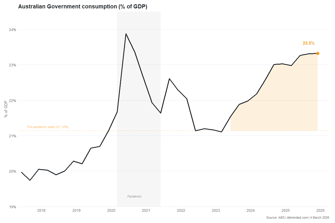
This is now a structural problem. Australia is in the midst of a productivity crisis, and deficit-financed government spending is one of the reasons for it. All levels of government are spending more, permanently, and the RBA is left trying (poorly I might add) to restrain domestic demand with one hand while the public sector adds to it with the other. Something's gotta give.


