Charts
A selection of macroeconomic indicators you're unlikely to see anywhere else.
This is a work in progress. We're starting with Australian indicators but will gradually expand to other countries. For now, only one chart from each category will be made available to non-members – sign up here to view all 10 of them.
Charts are updated within a minute of an official data release.
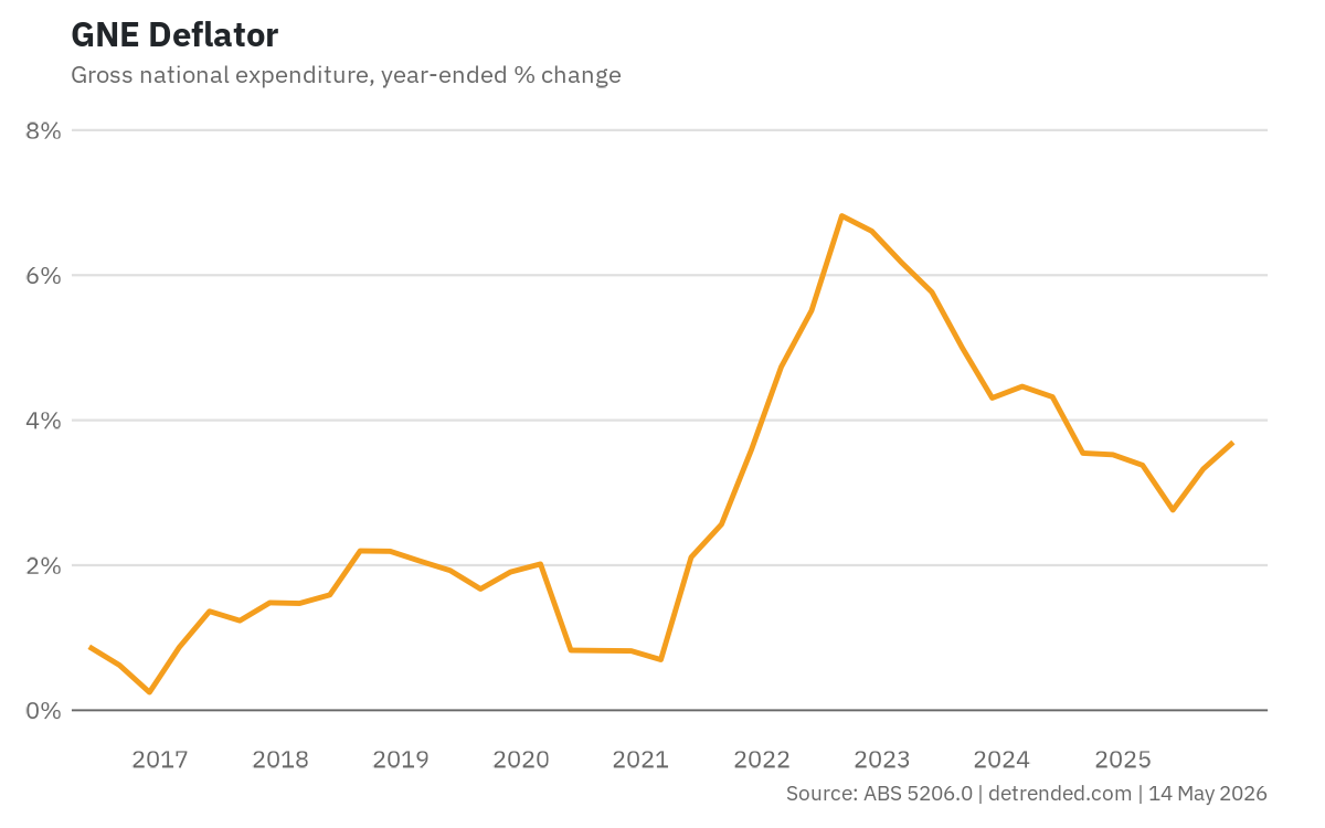
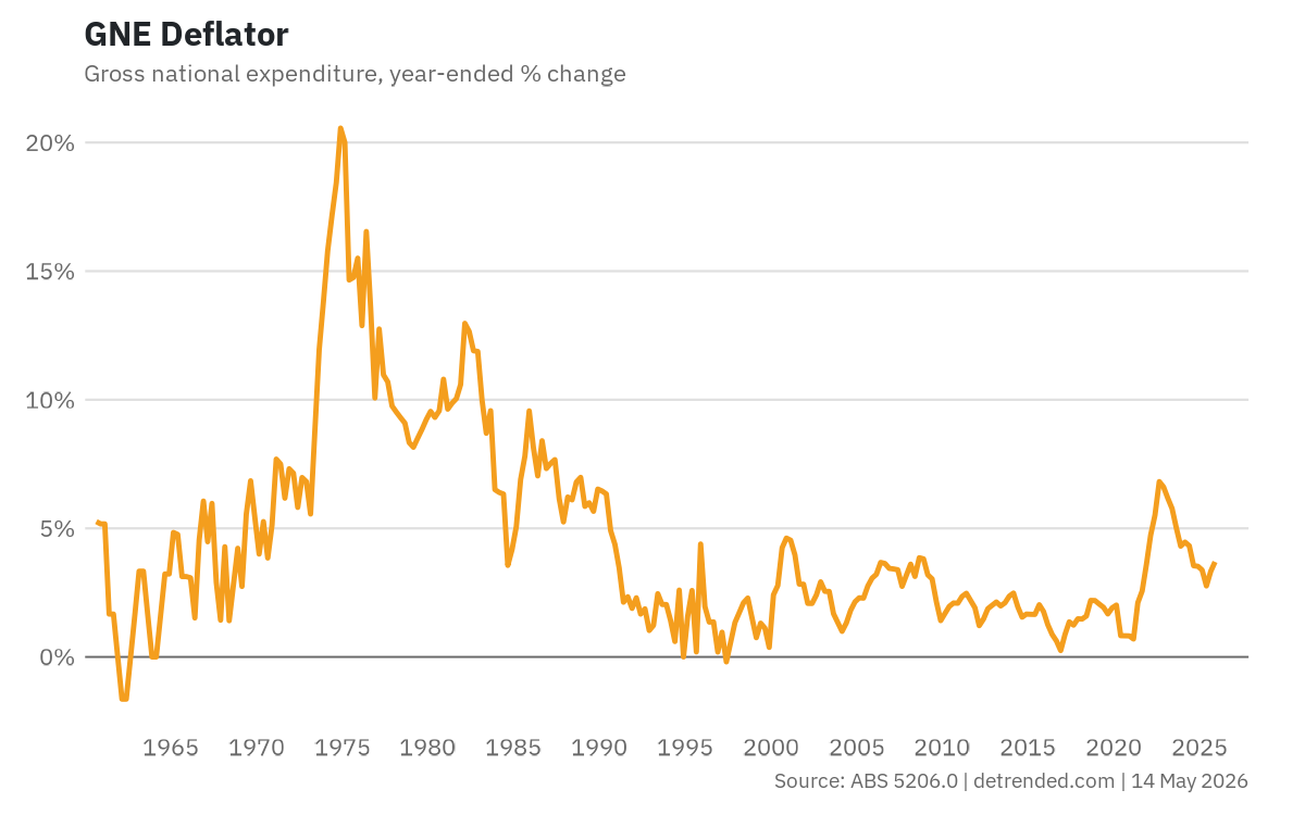
Prices
GNE Deflator
The GNE deflator measures price pressures across all domestic expenditure — consumption, investment, and government spending. Unlike the CPI, it captures price changes across the whole economy rather than a fixed consumer basket, making it a broader gauge of inflation and the preferred deflator for assessing real domestic demand.
Growth
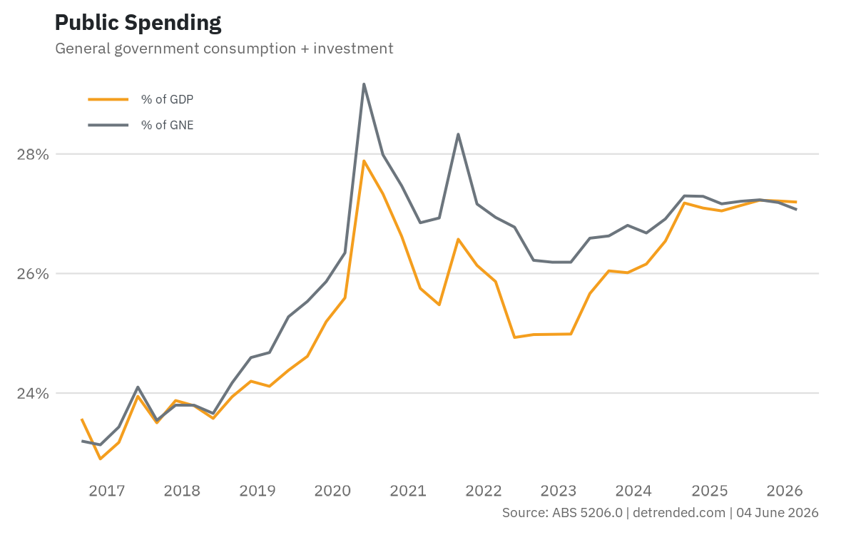
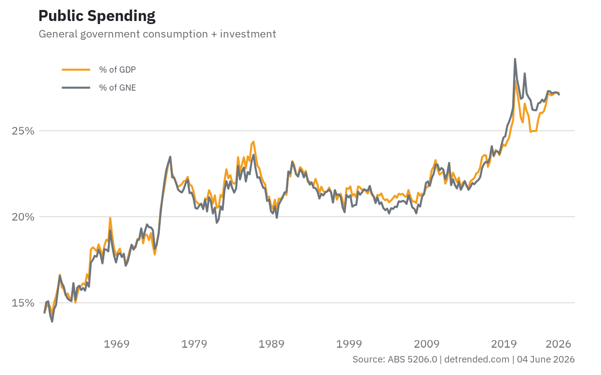
Public Spending
General government final consumption expenditure plus gross fixed capital formation, shown as a share of both nominal GDP and nominal GNE. The GDP share matters for fiscal sustainability because it reflects how much of total output the government consumes. The GNE share strips out net exports, showing government's claim on domestic demand. The two can diverge during commodity booms when surging export prices inflate GDP without adding to domestic spending capacity, making GNE the better lens for crowding out and demand management.
Labour
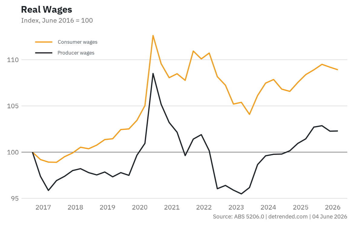
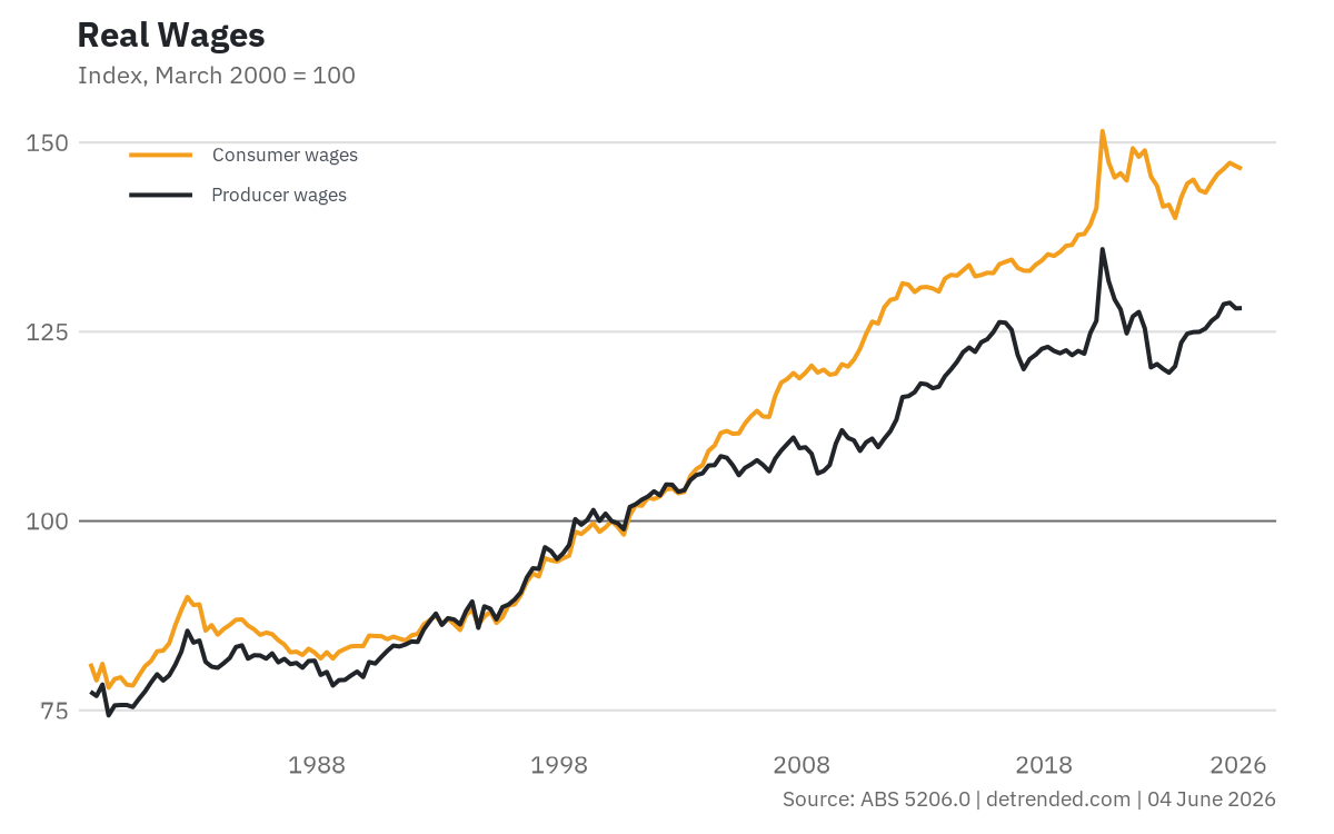
Real Wages
Consumer wages deflate total compensation per hour worked by the household final consumption expenditure deflator. Basically, what workers earn relative to what they actually spend it on. Producer wages use the GDP deflator instead, capturing what labour costs relative to the value of what the economy produces. The gap between the two can reflect inflation, terms of trade effects, and changes in the consumption share of GDP.
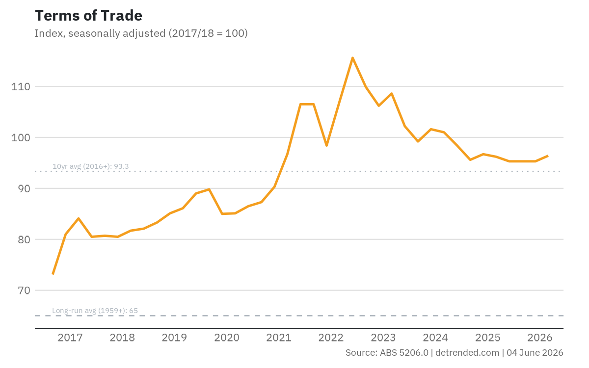
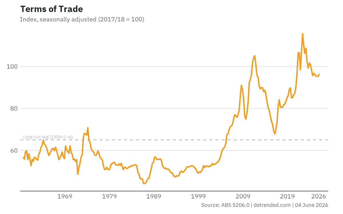
External
Terms of Trade
The ratio of export prices to import prices, seasonally adjusted. A rising terms of trade means Australia gets more imports for each unit of exports, typically driven by commodity price booms. The dashed line shows the long-run average, providing context for where the current level sits relative to history.